Pantone 2017 Colors
Here they are....the top colors for 2017.
With a sense of earthiness and the great outdoors, these colors are both calming and vibrant.
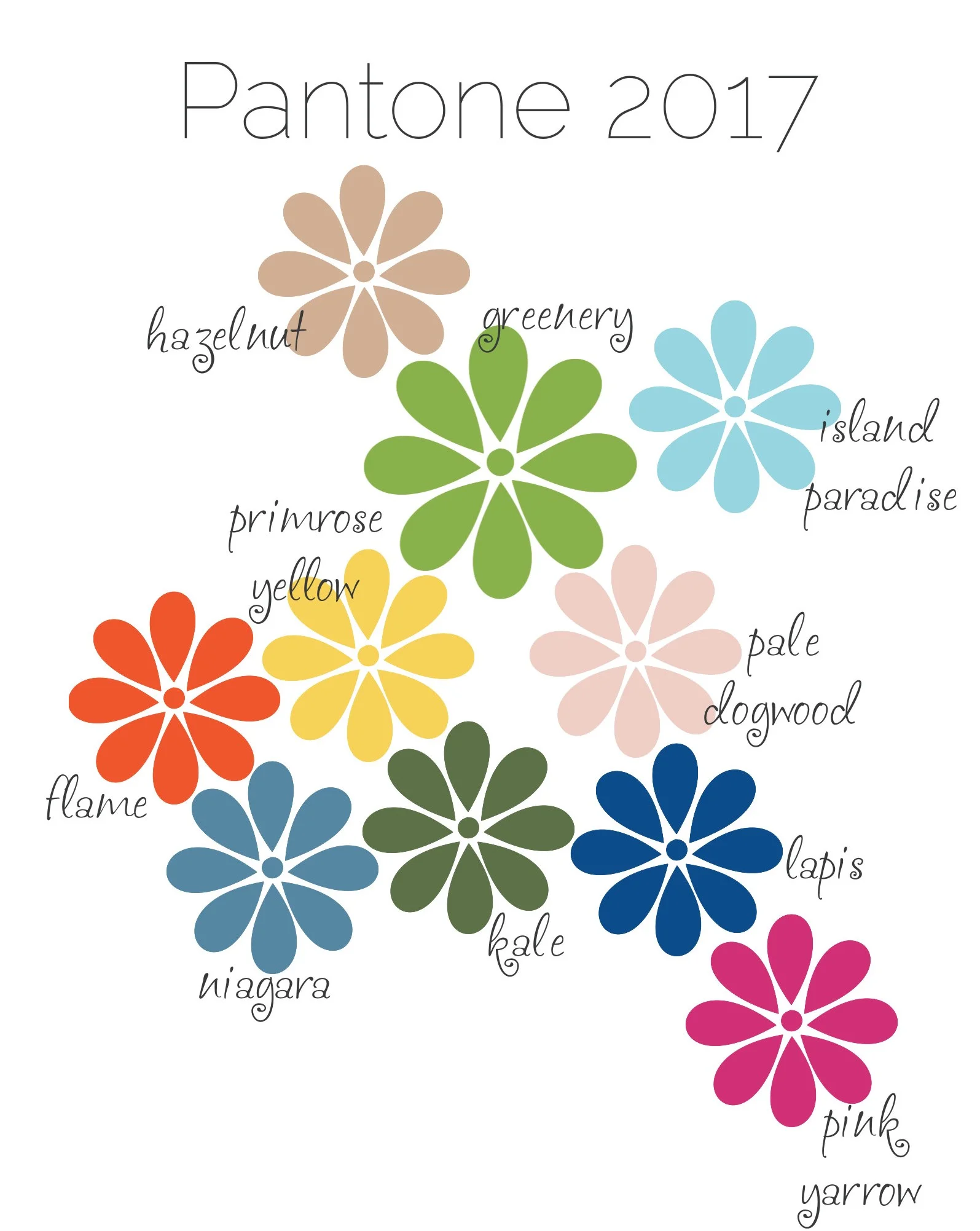
Greenery - The color of the year - Is about growth and reinventing ourselves. It is both fresh and simple.
Hazelnut - This shade is neutral and warm. It is at home in all seasons.
Island Paradise - A calming blue that brings to mind beaches and vacations.
Primrose Yellow - Such a happy color that reminds us of sunlight and buttercups.
Pale Dogwood - This soft shade is romantic, light and airy.
Flame - This warm shade is vibrant and energizing.
Niagara - This shade of blue is comfortable and welcoming.
Kale - Such an earthy, natural color that brings to mind foliage and the outdoors
Lapis - This blue is bold and versatile. It can be formal or whimsical.
Pink Yarrow - With vibrant attraction, this color is uplifting and festive.